Validate your results
Previous step: Step 3: Upload file & calculate
Validate your results
After importing your file, and at the end of the calculation, the Optimize module allows you to view the results on a map or in a table:
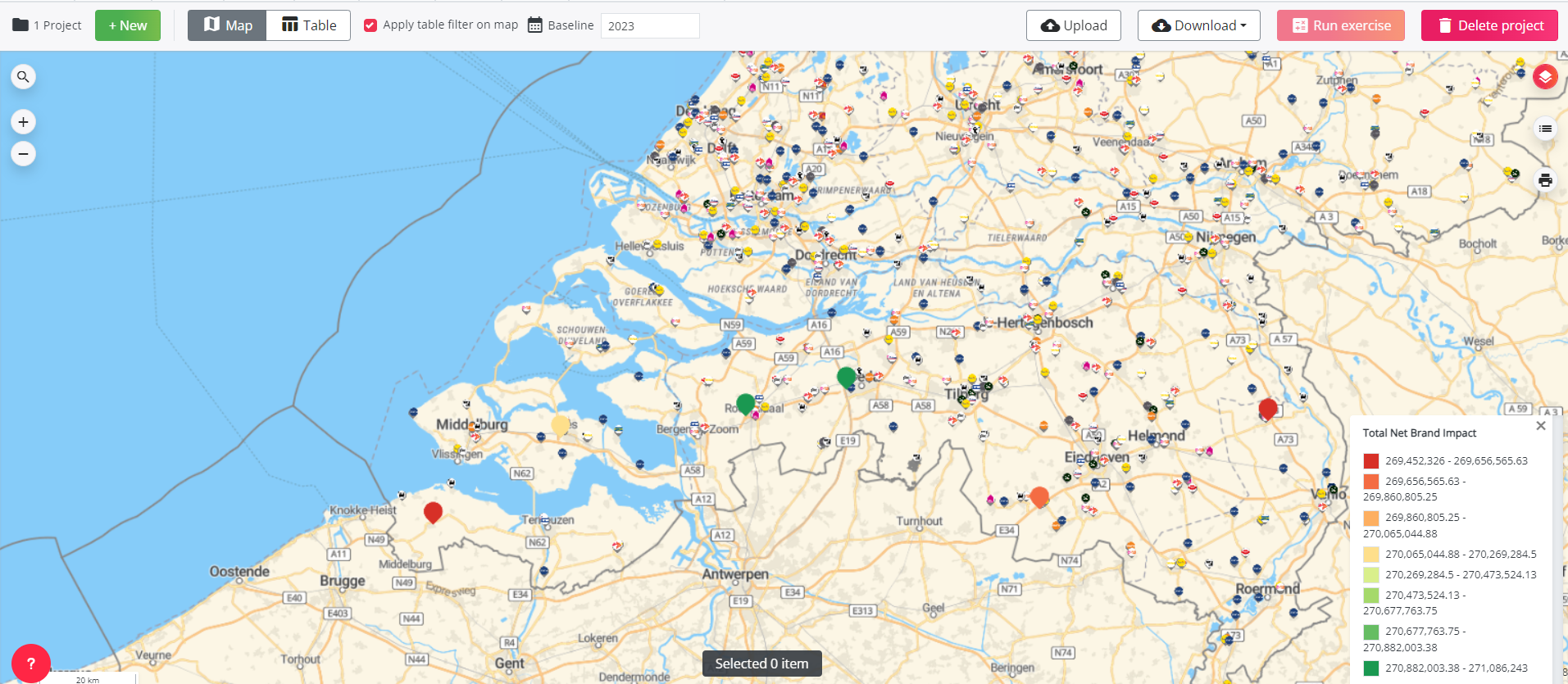
- In the case of a hotspot project, the map shows each location now in colour, from red to green. This represents the net impact of a location on the network as a whole. Red locations have a low net impact, while green locations have a high net impact.
- In the case of a reduction project, you will find the different locations you have selected on the map.
- In the case of an optimal location characteristics project, the map also shows each location where the characteristics changed in colour, from red to green. This represents the net impact of a location on the network as a whole. Red locations have a low net impact, while green locations have a high net impact.
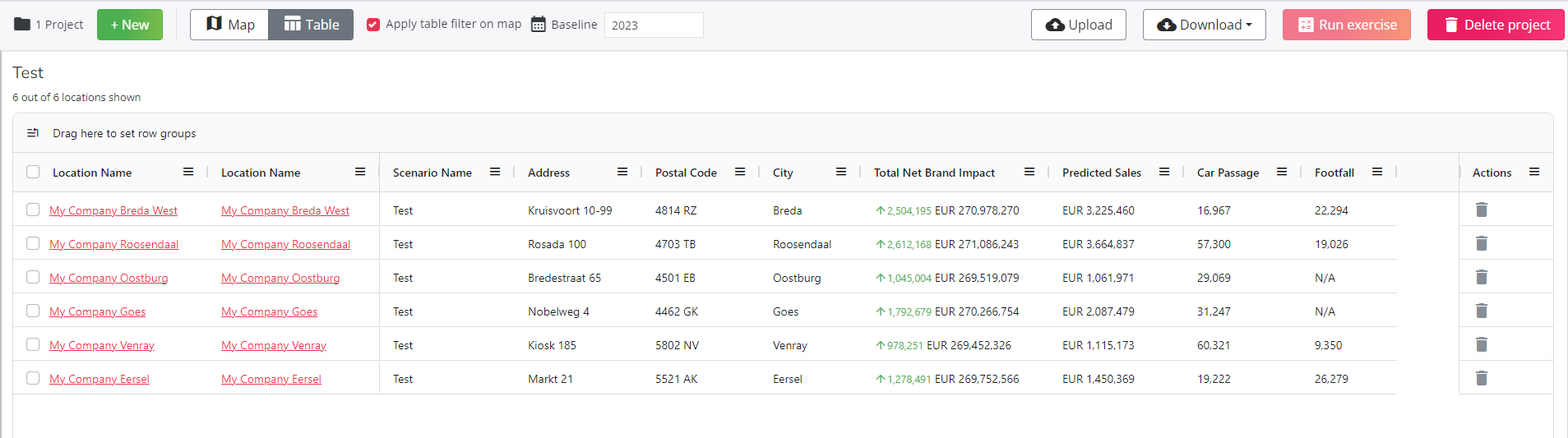
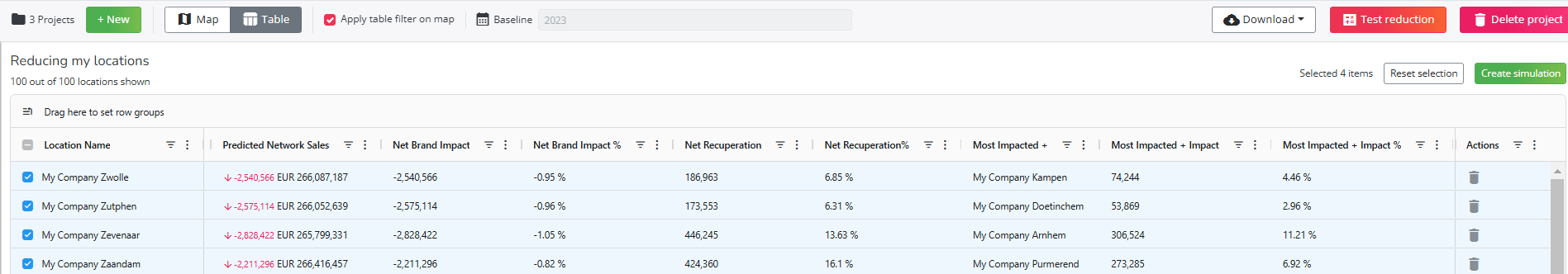
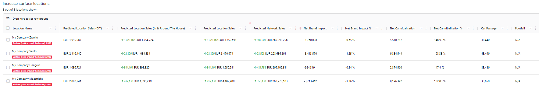
The table shows all the data for each of the sites on the list:
- For hotspot projects, you can find: predicted sales, total net brand impact, car passage & footfall around the location.
- For reduction projects, you can find: the predicted network sales, the impact on the brand (net and relative), the recuperation (net and relative), the name of the location most affected and its impact on that location, etc.
- For optimal location characteristics projects, you can find: predicted sales, total net brand impact, car passage & footfall around the location. The location name column now also shows which characteristic was modified and the specific change made.
For Chargeplanner users, please consult this article for detailed information on reviewing and interpreting the results of your charging point configurations.
It is possible to use sort / filter functionalities on the table:
- You can sort on a column by clicking directly on a column (low to high
vs high to low
vs no sort)
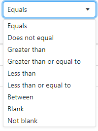
- You can filter on a column by clicking on
when you hoover over a column. You can choose between the following filtering functionalities
- If a column is filtered, you can see it in the column name indicated with this icon
- If you have applied filtering on the 'Table', you can go to the 'Map': if the option
is selected, the same filtering will be applied on the 'Map'. If you deselect
, the 'Map' will show all test locations without taking into account the applied filtering in the 'Table'.
- You can remove filtering in the 'Table' section by pressing on the filtered column